Now that AutoCAD is Windows-only and drawing text can be rendered with TrueType fonts, there is a strong case to abandon the old SHX-based font system. It never delivered good quality text quality and is really just a legacy of DOS-based CAD and now-ancient pen plotter technology.
The SHX system was devised as a solution to the major burden of text outline processing imposed on computers of the time (1980’s). Autodesk made a ‘minimalist’ font (TXT) the default, and provided a ‘QTEXT’ display command to suppress display of text entities and speed redraws and regens.
No-one bothers with QTEXT any more. With the combination of today’s computing power, raster based plotters and Windows-only operating environment it seems logical to pass text rendering off to Windows for greater efficiency. Using TrueType enables the typeset quality in virtually any typeface including the simpler styles suitable and required in engineering drawings.
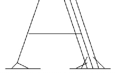
SHX fonts require the font ‘weight’ to be provided by plotter’s pen thickness. Text weight was defined by color, which in turn determined which pen the plotter would use; thin for small text, thick for large text. Generally SHX fonts only define a single centerline for the character strokes. Some of the fancy fonts, like Complex, provide ‘thick-&-thin’ styling by drawing side by side lines (multi-stroking) in the thicker areas and assume the pen thickness will merge them on the paper. If you plot large text with a fine pen it always looks awful, and if a multi-stroke font is used, the separate strokes become clearly seen.
 The SHX system can build characters by straight lines and arcs (no Bezier or spline curves), but in fact the fonts provided with AutoCAD don’t even use arcs. The curved parts are sequences of very short straight line segments. How else can they be described but ‘crude’ and ‘jerky’.
Presentation Quality & PostScript
CAD drawings are being used more and more as display and promotional graphics in addition to their original purpose as design, tender and construction drawings. For presentation work and CAD work that was being produced for publishing purposes it became necessary to use the best quality of text available. In the late 80’s and early 90’s the best and most appropriate system was Adobe’s PostScript.
Autodesk went to some considerable lengths to provide this facility for AutoCAD users. Although the potential was there to deliver high quality text, the system was never implemented well enough and adequate results could only be achieved with a true Postscript printer. Postscript is a universal cross-system standard and the normal method in publishing houses, widely supported on UNIX and Macintosh computers.
Now that AutoCAD is Windows-only, Autodesk has abandoned Postscript, even though these is a still a strong case for its use. AutoCAD users producing work for publication (maps, guides, atlases, reports, etc) still require PostScript output for quality and compatibility with publishing systems they need to interface with. These users still use the add-on PostScript systems that have been using for years. Even when AutoCAD did have Postscript support, it was rarely good enough for their needs.
Enter TrueType
TrueType was devised as a lower-cost equivalent jointly by Apple and Microsoft (remarkably!) To avoid Adobe’s high licensing fees, and is now the better alternative for anyone on Windows or Mac other than those who have to work with the publishing industry.
 TrueType is a standard component of Windows (and MacOS). It is a quality WYSIWYG text rendering system that provides device-independent, typeset-quality output. As a function of the operating environment, applications can pass that overhead off to the operating system and dedicate themselves to their own specialized processing.
Autodesk introduced TrueType support to AutoCAD in Release 13; a harbinger that AutoCAD would soon become an exclusively Window-based application.
To assist with the transition to using TrueType, Autodesk sensibly provide TrueType fonts that mimic the long established SHX fonts. However this is done in a way guaranteed to annoy. Installing AutoCAD automatically installs a very large number of crude looking SHX look-alikes into your Windows font repertoire, without any option to restrict the selection.
The strange thing is that they not only provide one TrueType font for each of the old SHX variety (including those that are almost never used), but also a lot of additional ones too. Many of those (like the ‘Proxy’ series) appear to be just TXT duplicates and I cannot see why anyone would ever want to use any of them.
 The new fonts even include that ungainly relic of the earliest days of CAD on slow Pcs, the TXT font. TXT should have been relegated to the garbage bin years ago, even in SHX form! Yet it still remains the default font in AutoCAD, and it’s amazing how many AutoCAD users continue to use it all the time, probably just because it’s the default. Its use makes perfectly good drawings look highly unprofessional.
The thing I don’t like about all this is that the SHX look-alike TrueType fonts over-faithfully mimic all the original fonts’ scrawny line-based appearance and jerkiness.
TrueType Times Roman This TrueType example shows the outline of curves and lines that preserves the correct proprtion of the character regardless of output device, resolution or text size.
TrueType, like Postscript, is a system based on Bezier curve outlines and infills. Characters are always defined as infillable outlines, so that the proper character ‘weight’ is maintained in proportion to and regardless of, the text size.The use of Bezier curves ensures that outline curves remain smooth even at extremely large point sizes.
Autodesk’s Mistake
Why were the SHX equivalents defined this way instead of as filled outlines? Why were the inherent qualities of TrueType ignored in creating True Type equivalents of SHX fonts? These AutoCAD supplied TrueType fonts will never be of any use other than to mimic SHX fonts in AutoCAD drawings with an even poorer quality of output. They contribute to the clutter in the Windows font system – a collection of fonts also available to Word and any other Windows program.
Why do the Autodesk setup programs install all these useless and badly designed fonts automatically and without user selection or confirmation? It annoys me no end although I’m probably affected more than most users of Autodesk products, because I install many packages and versions for review. Every time I install an Autodesk product it adds all these undesirable fonts over again, wasting my time manually searching and destroying them yet again. This is the same for all current versions of AutoCAD, LT, Mechanical Desktop, Map, CADOverlay, and others. Now I keep a copy of my WindowsFonts folder, so I can easily copy it back when required overwriting and removing un-required fonts in the process.
There are also several rather more conventional TrueType fonts. Sadly, they do little more than duplicate the ‘Times’ appearance, only in a cruder form. If you want to use publication-quality Serif Roman style text like Times in your drawings (and why not indeed?) Then you can use the fonts already standard in Windows, or the extras provided with Office – Times New Roman, Century Schoolbook, Book Antigua, etc. There’s no need for a CAD product to supply that sort of font. What would be more useful is a set of TrueType ISO/DIN drafting fonts properly defined. Yet users are required to source those from third party font suppliers.
Imagineer, TurboCAD, IntelliCAD
 It is worthwhile to consider how some of the other Windows-based CAD products use TrueType fonts. They usually supply a few fonts that look more in keeping with traditional drawing board pen practice than the publishing-oriented fonts normal in Windows. These fonts are invariably properly defined, filled outline fonts. Some mimic the ‘Graphos nib on edge’ style that was popular with pen and ink users. They also usually provide some font substitution mechanism to handle the AutoCAD SHX font names found in DXF files. It seems easy enough for these vendors to handle. Why has Autodesk implemented all this so poorly?
Intergraph has the best scheme I’ve seen in its Imagineer Technical program. Intergraph supplies some very well made TrueType fonts that accurately render the ISO/DIN ‘lettering-guide’ CAD text and the USA standard ‘Leroy’ stencil style. Both Intergraph and IMSI (TurboCAD) also provide good mono-spaced fonts, which are very useful in tabulated data, and usually hard to come by from general Windows font sources. Intergraph seem to be adept at keeping their best products secret!
Autodesk seems to be migrating users to TrueType, yet it still implements TrueType as a subsidiary system requiring more resource overheads than SHX. The reverse ought to be the case, since TrueType is a built-in Windows sub-system available to any application, and should relieve the CAD program of processing overhead to make use of it. There are many reports of TrueType in DWG files resulting in larger filesizes and slower operation, although I haven’t verified those claims personally.
 Perhaps there are complications embedding TrueType data in the DWG file format. Visio’s IntelliCAD programmers indicated to me that they were having difficulty implementing TrueType in IntelliCAD, and it would not be incorporated in the first release. Yet Visio uses TrueType exclusively and efficiently in Visio Technical. Of course, Visio is a 100% native Windows system that accesses DWG files as a translated import/export option (as does TurboCAD) without the dominating requirement of maximum and back-dated DWG format compatibility.
IntelliCAD currently avoids this issue by not supporting TrueType at all. However, it does handle the to-&-fro data transfer without upsetting any TrueType fonts in the DWG file, and substitutes SHX fonts while in IntelliCAD in a sensible manner.
TurboCAD v5.0 uses TrueType fonts only, and implements TrueType far better than AutoCAD does, including supplying sensible fonts. But TurboCAD falls down when translating to and from DWG files. It substitutes Times New Roman for all fonts (SHX or TTF) found in a DWG file, and when saving as DWG converts all TurboCAD text to SHX fonts in AutoCAD’s ‘normal’ Style which is normally that awful old TXT font. It also (irreversibly) converts AutoCAD multi-line paragraph text to a single very long line. This behavior may be improved in the new TurboCAD Pro 5.1 update, which I haven’t been able to try yet. The Future
Maybe this is a transitional stage for Autodesk and that text handling with be handed to Windows in the future. I hope AutoCAD Release 15 (or whatever the next major version will be named) will abandon SHX completely, do sensible font substitutions for old drawings, make full and efficient use Windows and allow us to use TrueType, and replace the badly-produced fonts that we are currently forced to install.
Third Party Fonts
On the subject of fonts, remember that the use of 3rd party commercial SHX fonts should always be avoided in any drawings that are shared in a collaborative situation.
Third-party fonts help you to produce good-looking prints to send to people, but present a problem if you send copies of the DWG files, you also need to send copies of any non-standard fonts. In the case of third party commercial fonts this is almost certainly a breach of your licensing conditions.
If you want better than average fonts, I’d suggest it’s time to move to TrueType.


